leslie
Seattle.gov - Case Study, 2025
REDUCE TIME TAKEN BY USERS IN DISCOVERING VITAL INFORMATION AND FINDING RELEVANT DOCUMENTATION
MY ROLE
Product Strategist
UX Researcher/Designer
Information Architect
Usability Testing Lead
Project Coordinator
SOFTWARE
Figma
Obsidian
Lyssna
Mermaid
DURATION
4 Months
Background and Problem
GOVERNMENT WEBSITES ARE (GENERALLY) BAD :(
Residents face significant barriers when interacting with city government services online. The existing structure forces users to navigate multiple disconnected systems, leading to: inefficient document tracking, fragmented user experience, and a host of accessibility concerns.
The scope of this project includes a primary focus of designing a personalized portal feature for the existing Seattle.gov website by targeting users who regularly interact with city services.
Key constraints with this project were working within existing infrastructure of an established website, adhering to accessibility guidelines, the limitations with current technology, security standards, and budget concerns.
LACK OF TRANSPARENCY
No updates after a document has
been submitted
POOR ACCESSIBILITY
Poor overall accessibility and
responsive design was lacking
FRAGMENTED INFORMATION ARCHITECTURE
Users struggle with finding pertinent information
Research and Discovery
THE DATA
My research approach used competitive analysis, user interviews, persona development, and affinity mapping as my synthesis. Drawing data from three platforms praised for their government designs (GOV.UK, NYC.GOV, UTAH.GOV) I created a matrix of strengths, weaknesses, functionality, and areas where I could improve my product.
User interviews, conducted using a diverse sample of Seattle residents, showed many of the same problems initially considered in the problem section of this project. The pain points to consider here were: Document status uncertainty, fragmented systems and multiple logins, and barriers to accessibility. By using Personas, I could paint a clearer picture for how to design the portal by creating a story with clear expectations for user needs.
Further synthesizing the data collected, I ran an affinity test, where all of my research findings were clustered into themes. From here, I was able to narrow down the feature set and consider a path forward for my designs.
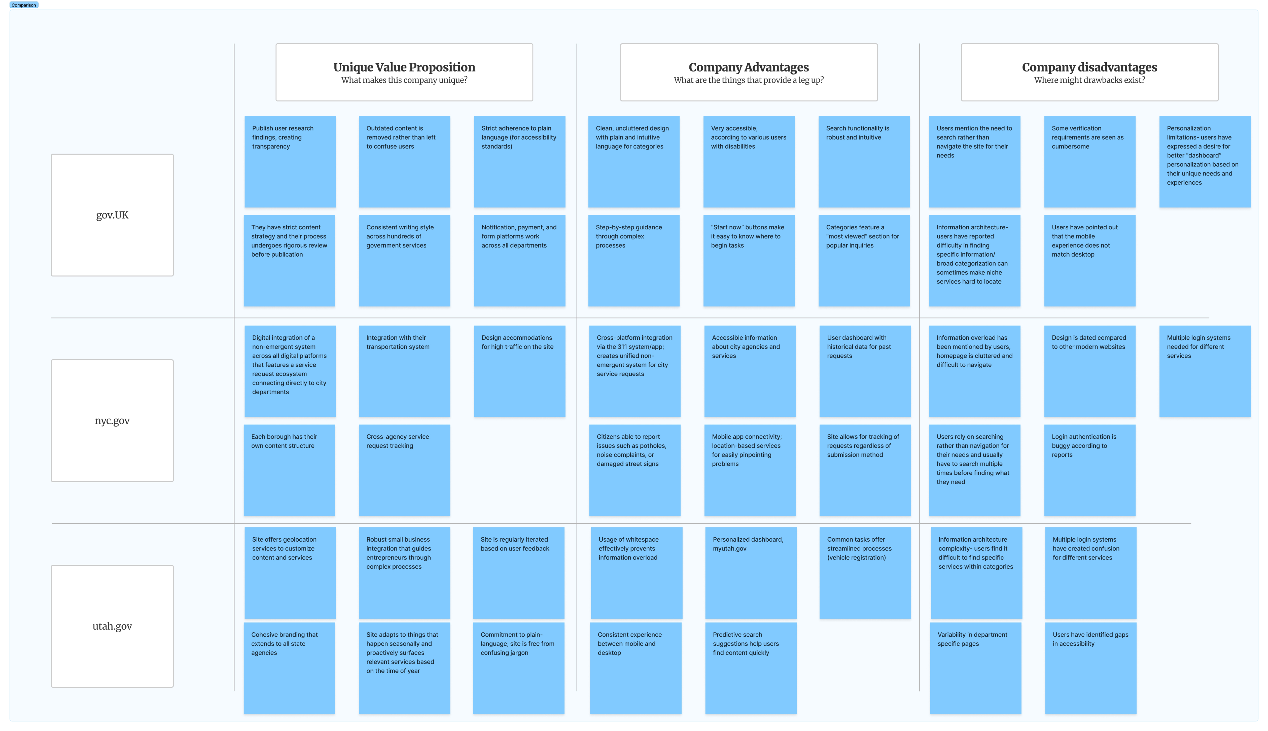
COMPETITIVE ANALYSIS: HOW TO BUILD A WELL-DESIGNED GOVERNMENT SITE
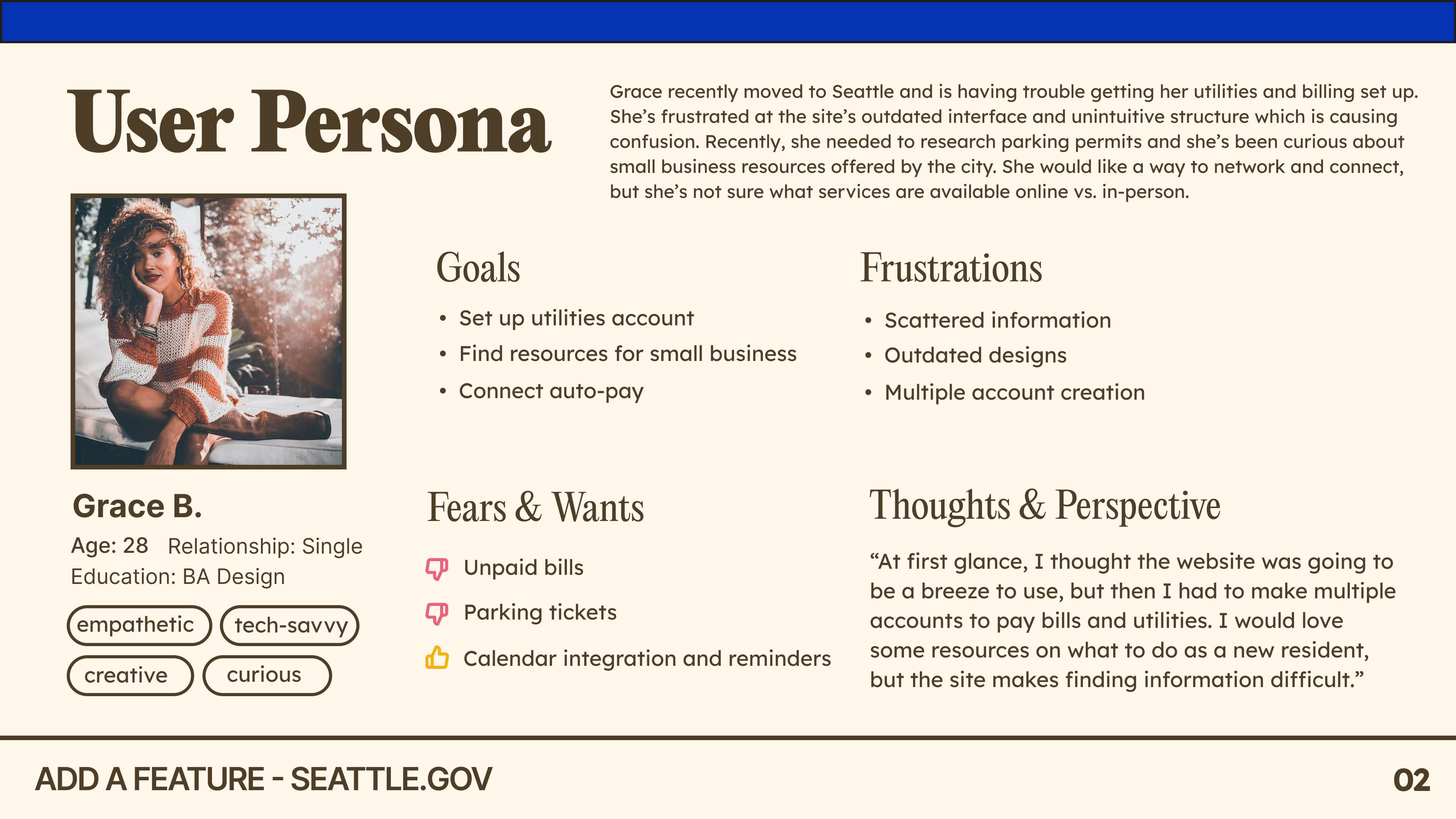
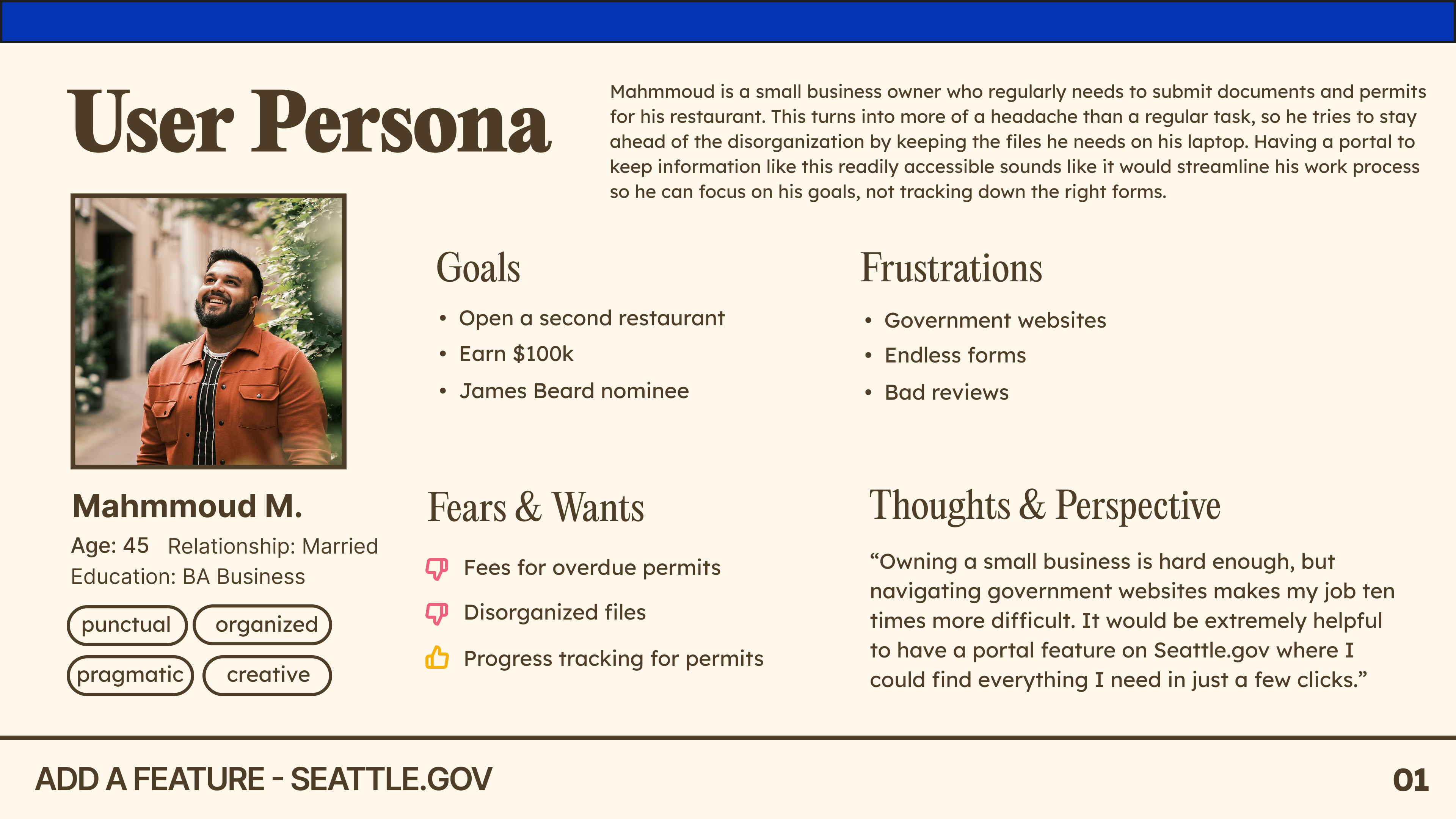
USER PERSONAS: WHO ARE WE DESIGNING FOR?
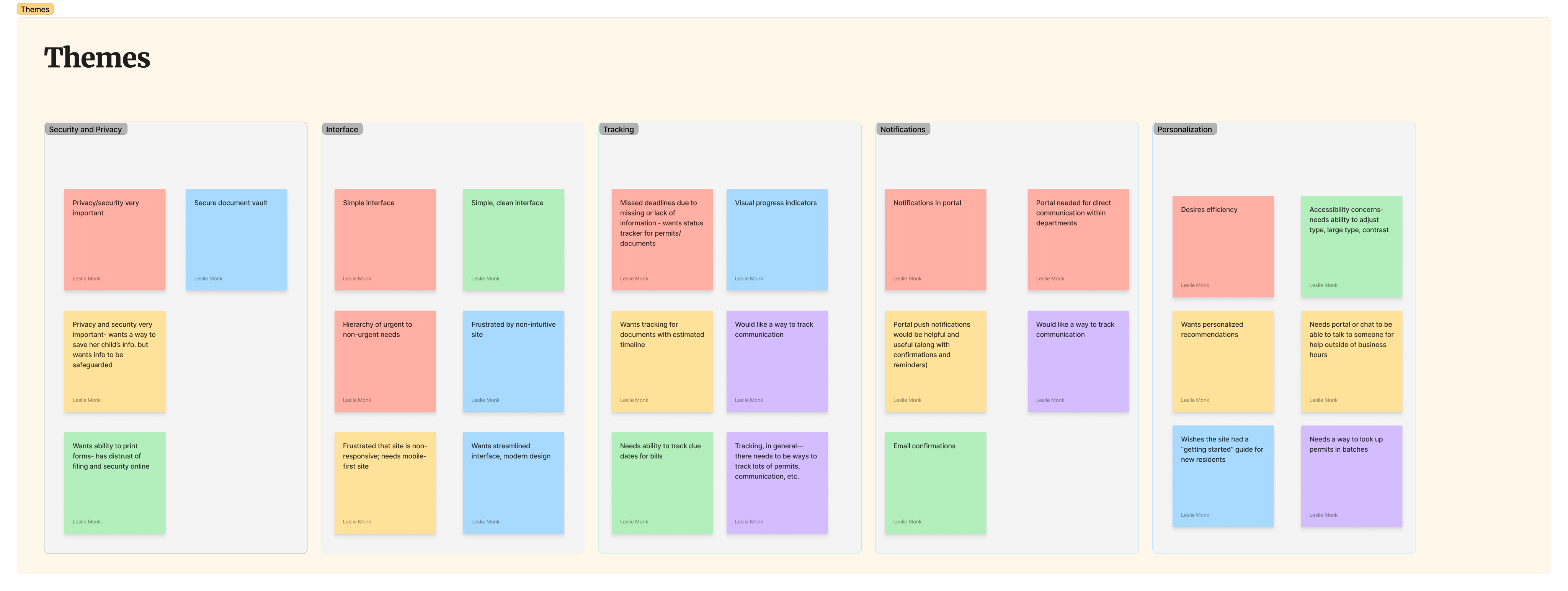
AFFINITY MAP: KEY THEMES CONSIDERED BY USERS
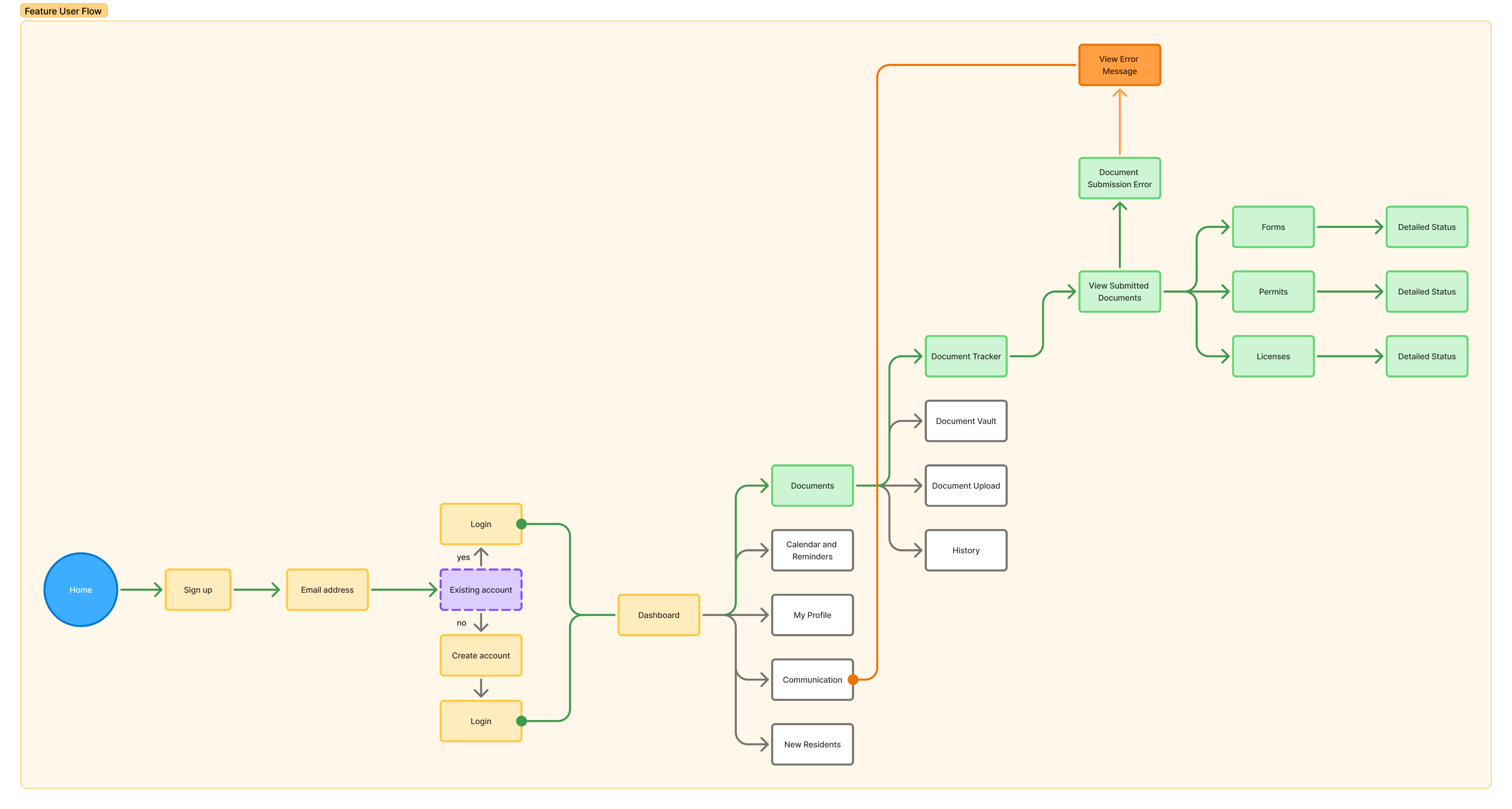
USER FLOW: CONSIDERING HOW USERS WILL NAVIGATE THE PORTAL
Design
THE SOLUTION
Low to High-Fidelity Evolution
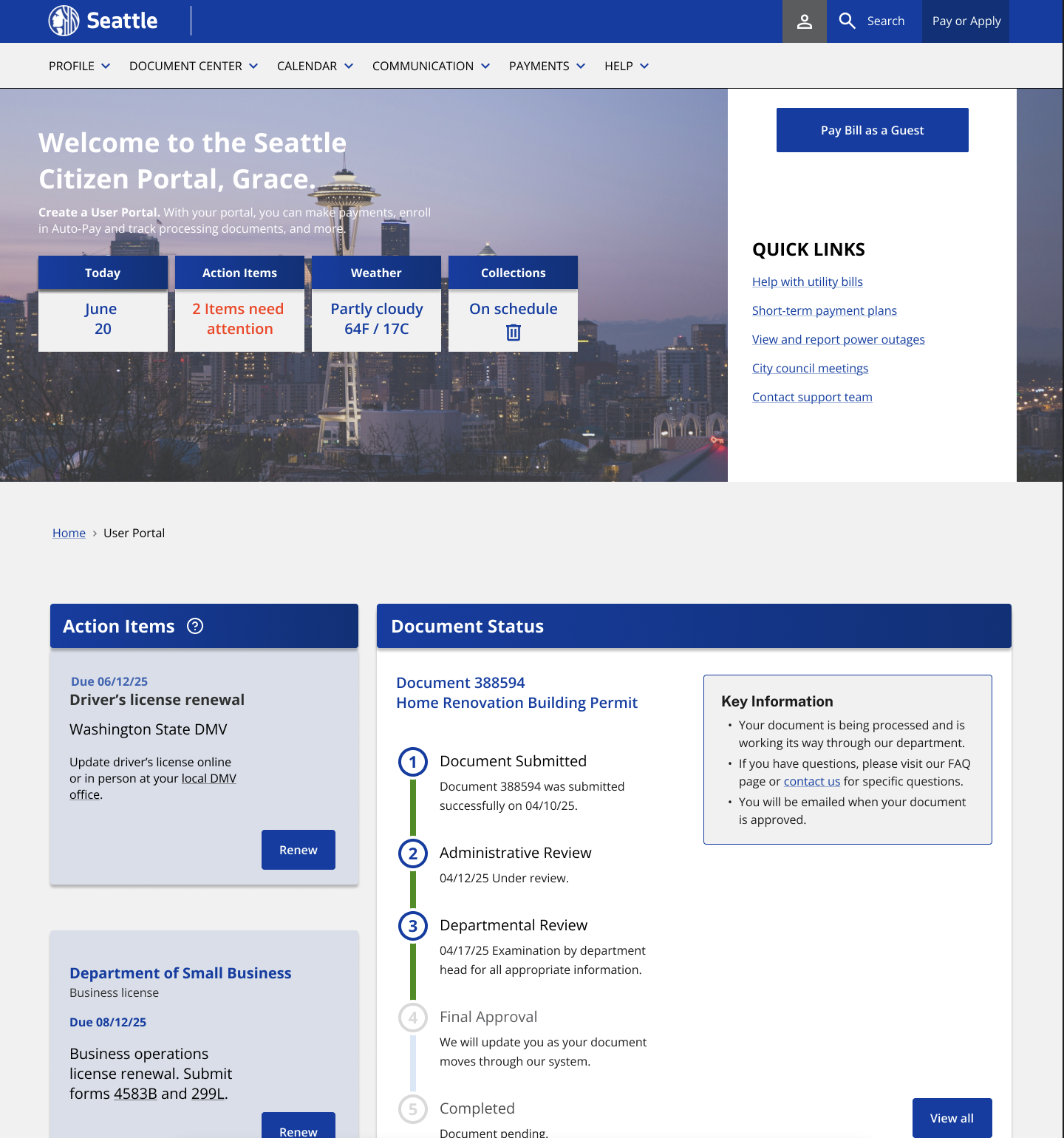
Based on user feedback, I made key changes between low-fidelity wireframes and final designs. The biggest change was splitting document management into two screens: Document Status for users who want detailed tracking, and Document Center for quick overviews.
I also improved the visual design with a card-based system that works on mobile, added progress bars so users can see real-time status updates, and put accessibility controls (text size, contrast) directly in profile settings. The navigation changed from a basic accordion to a portal system that keeps context across city services and gives quick access to common tasks.
User-Centered Design Impact
Every design decision addressed specific problems from my user research. The document dashboard fixes permit status confusion, accessibility settings and simpler navigation work for users who struggle with complex websites. The guidance system helps new residents figure out unfamiliar government processes.
This approach changed a confusing, disconnected government experience into a clear, efficient portal that works for both citizens and city operations.
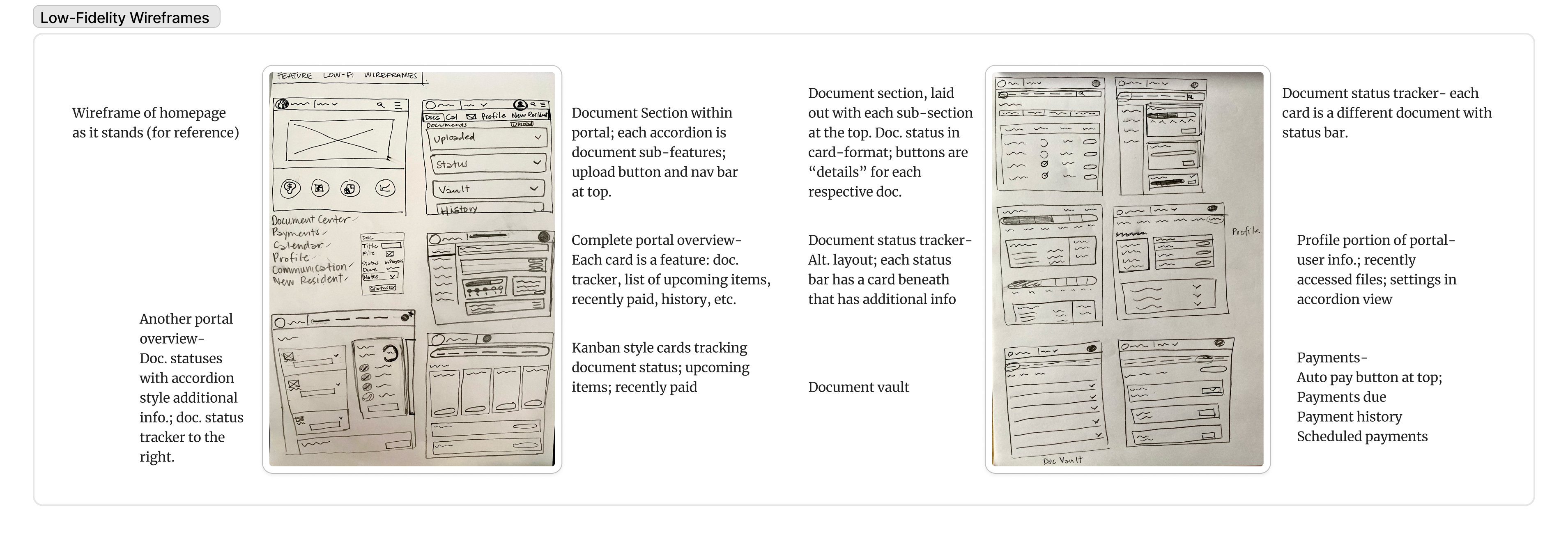
LOW-FIDELITY WIREFRAMES
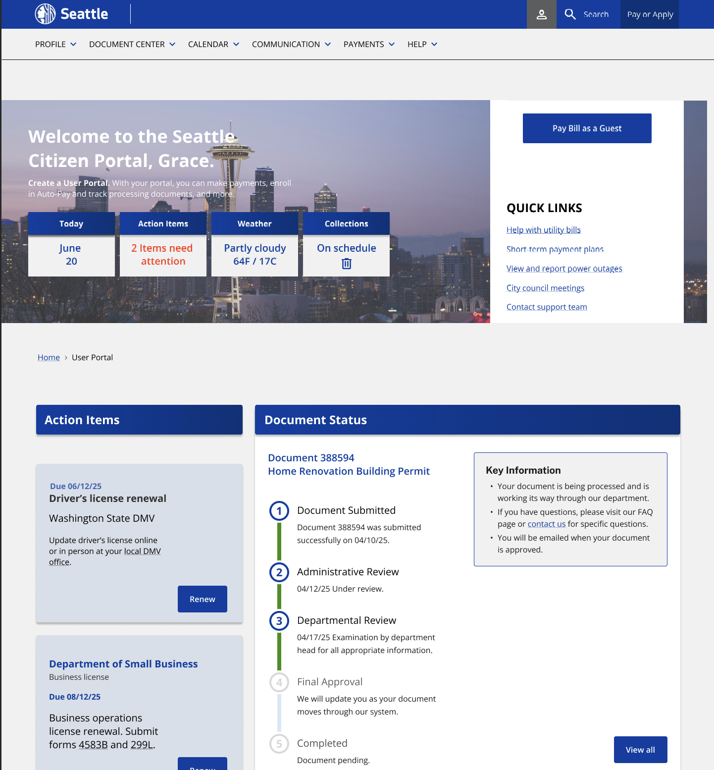
HOME/USER PORTAL MAIN PAGE
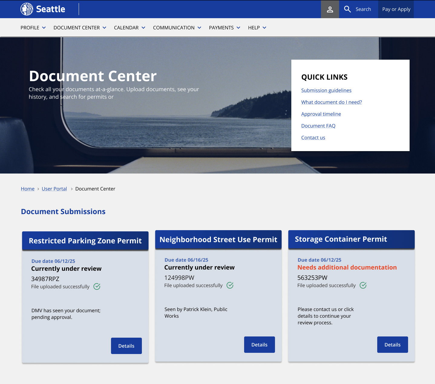
USER PORTAL DOCUMENT CENTER
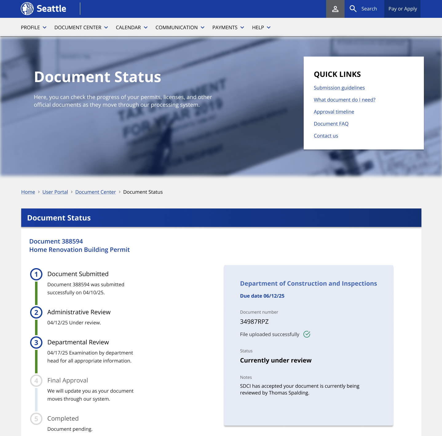
USER PORTAL DOCUMENT STATUS (DOCUMENT TRACKING)
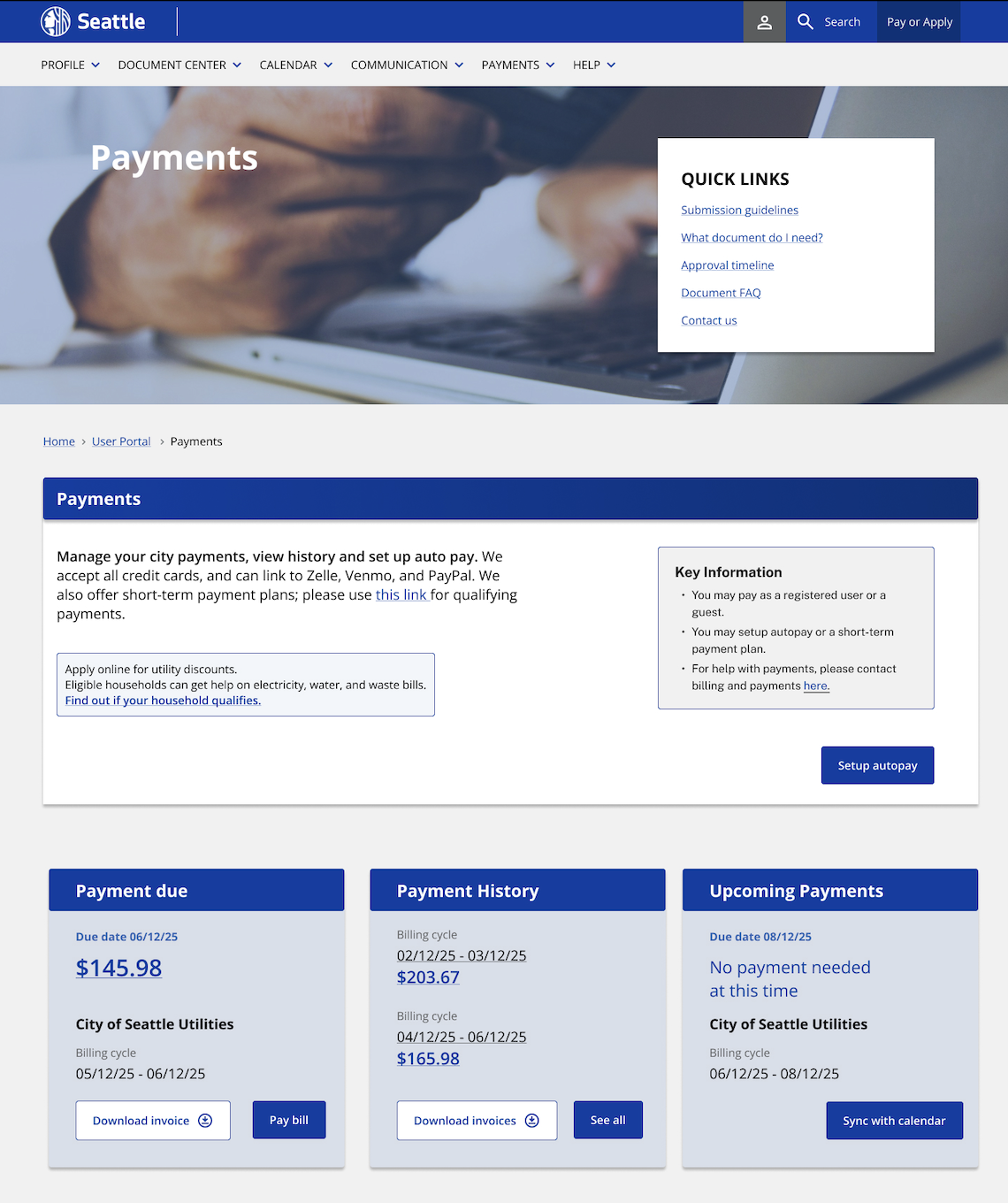
USER PORTAL PAYMENT CENTER
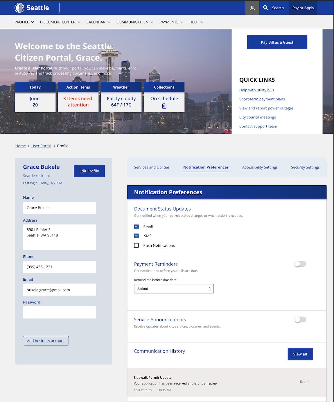
USER PORTAL PROFILE (SETTINGS)
Testing and Results
VALIDATION AND TESTING
I conducted moderated usability testing with 5 participants from my initial interviews. Testing sessions lasted 45-60 minutes each, using think-aloud protocol only intervening when participants were completely stuck on the prototype screens.
User testing showed most tasks worked well with only small changes needed before launch. I focused revisions on accessibility and matching how users would expect this system to work (a key usability heuristic). Key fixes included reordering some screens, adding tooltips for clarity, and creating a session timeout toggle for better security.
Reflection and Learnings
TAKEAWAYS
Lead with accessibility in mind, rather than making changes to finalized designs. Building features that cater to all people is much more efficient AND cost-effective! Retrofitting accessibility features costs much more than building them in from the beginning, and often results in clunky solutions.
Government UX requires a lot of empathy and compromise. Unlike commercial apps where users choose to be there, people use government services because they have to. Instead of making a flashy site, focusing on function over form was best for this project. When someone needs to renew a permit or pay a fine, they want speed and clarity, not animation.
EMAIL :)
lesliermonk@gmail.com
SOCIALS
Copyright © 2025 Leslie Monk
This website is typeset in VT323 by Peter Hull